Theme color settings
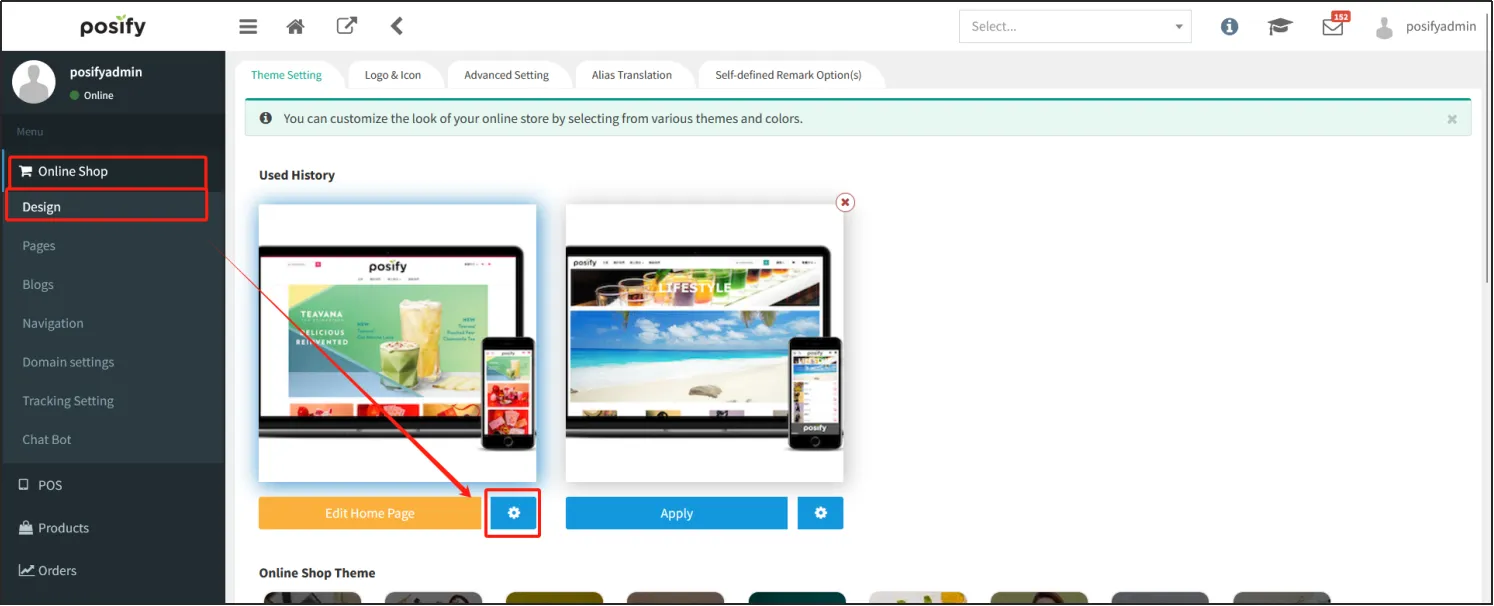
Open the CMS click on the online storeclick on the designclick on the tab Theme Settingsclick on the gear icon on the right side of the theme.
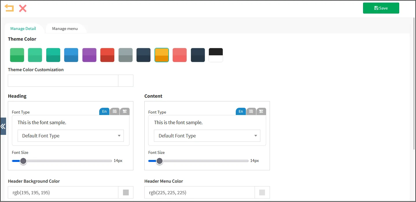
Here you can edit the theme colors of your store as well as the warehouse (top navigation).
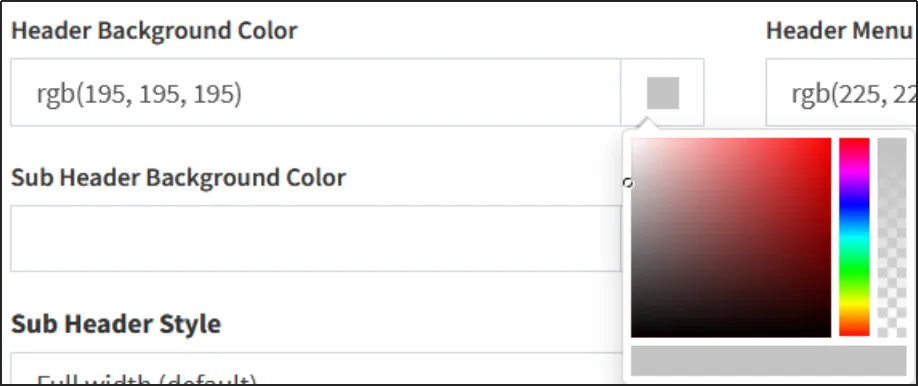
You can customize the theme colors by selecting a color through the color picker or by entering a color code directly.
When you are done editing, click [Save].
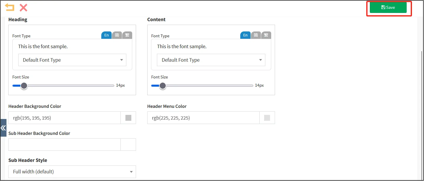
Custom theme color: Enter rgb(0, 0, 0)
Title Font & Font Size: This is to control the font and size of the product name of the online store.
Content Font & Font Size: This is the font size that controls the store menu and the font size of the product detail page content.
Top Background Color: Enter RGB (255, 255, 255, 1).
Table of Contents Word Color at the top of the page: Enter rgb(0, 0, 0).
Top Directory Background Color: Enter RGB (255, 243, 255).
Search bar background color: Indicates the background color of the online store's search bar.
Product Details Price Background Color: Enter #ff0000.
Select SKU color for product details: Enter #ff0000.
Additional background color: Enter #dfe2e4.
Additional text color: Enter #ff0000.
Promotion Background Color: Enter #DFE2E4.
Promotion text color: Enter #007aff.
Combine product background color: Enter #dfe2e4.
Combine product text colors: Enter #ff0000.
The following figure shows the effect of the theme-related color settings.
Company logo and icon
The company's logo and icon are often displayed on the homepage of an online store.
Here's how to upload your company logo and icon:
Open the CMSclick on the online storeclick on the designclick on the tab logo and icon.
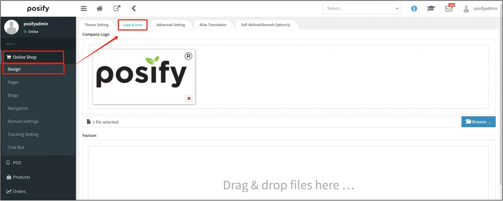
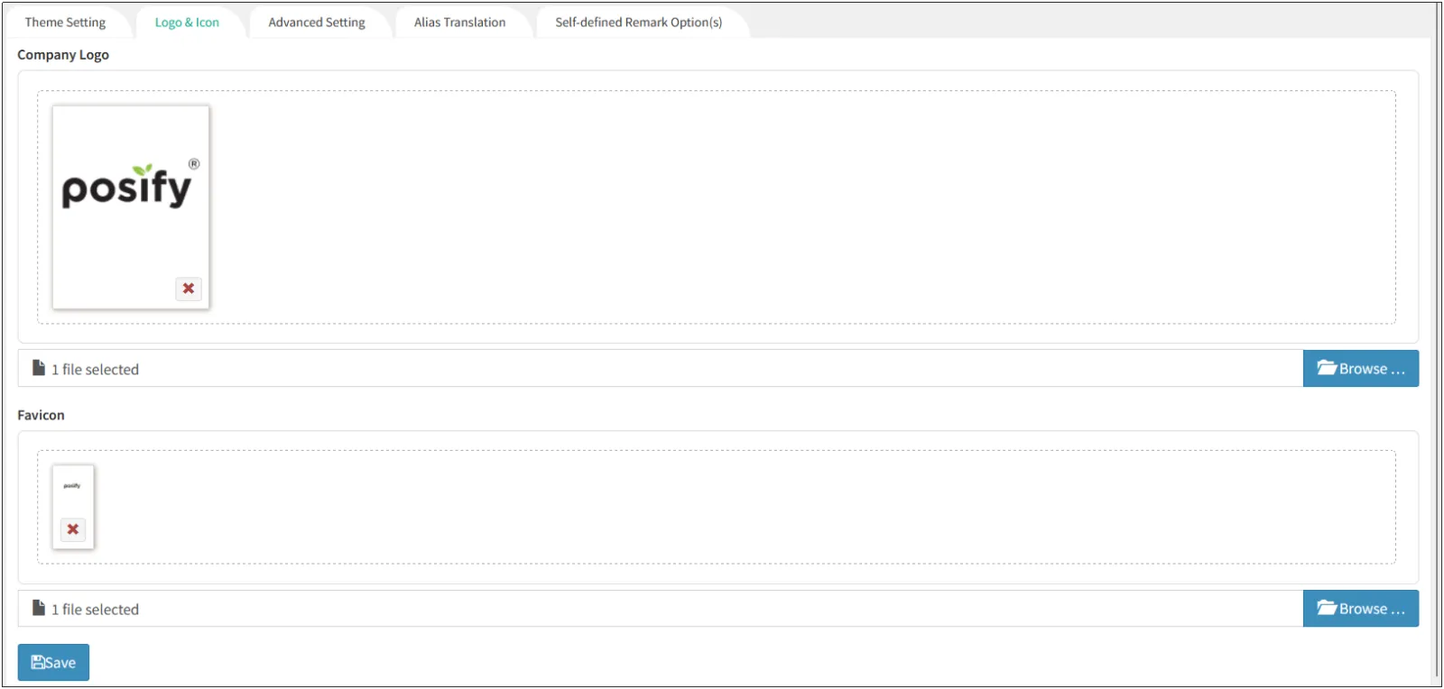
Click [Browse...] Upload your company logo and website icon separatelyclick [Save].
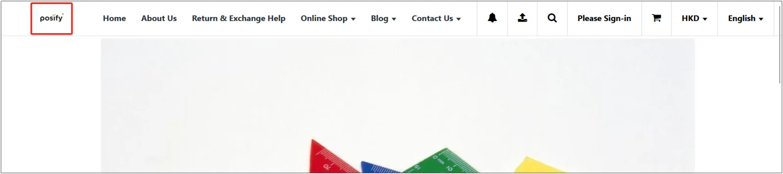
After [Save], open the front desk of the online store, and you can see the company logo displayed in the upper left corner.
A small website icon appears in front of the name of the browser tab.

Edit your home page
Now that we've made a simple homepage in the previous playbook-Site Editor (Beginner), let's move on to the advanced ways to edit your homepage.
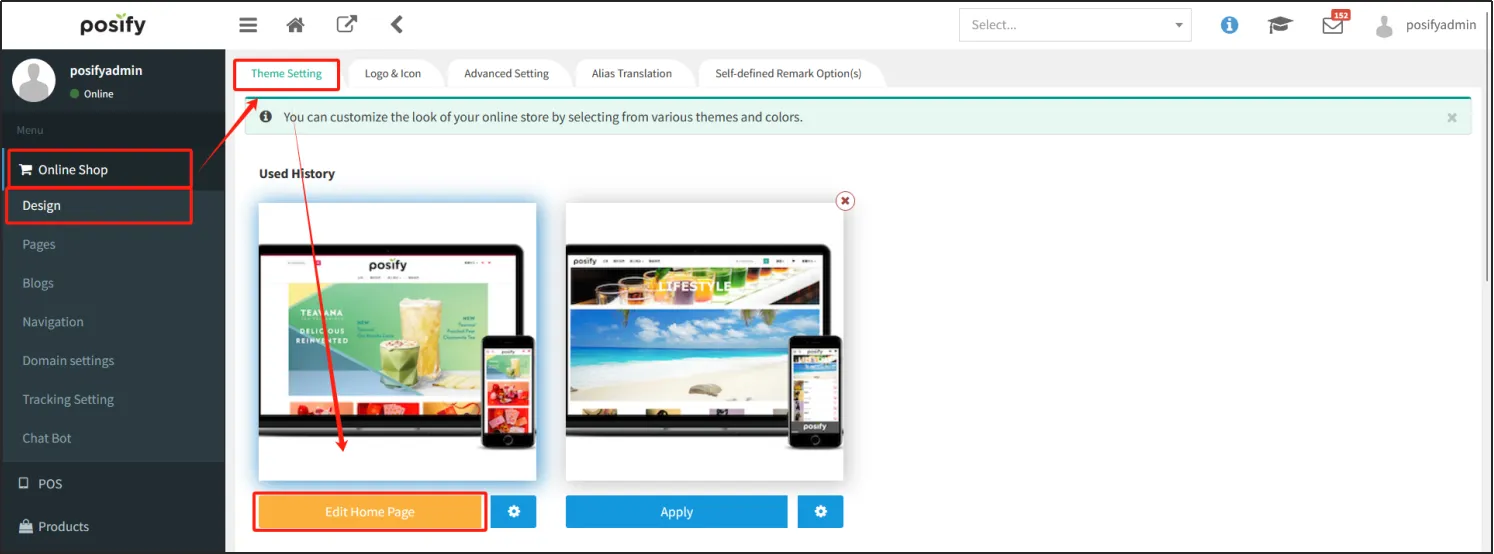
Open the CMSclick the online storeclick the designclick the tab theme settings, you can see the online store theme you have selected under [Recently used]click [Edit Home] to open the homepage editing page.
Zoom in/out of the website editor
By selecting the percentage above to zoom in/out of the website editor, you can get a better look at the homepage as a whole and in detail.

Click "Desktop Preview" to preview how the current page will be displayed on the web. Tap the small triangle next to it, and you can also tap [Phone Preview] to preview how the current page will look on your phone. The drop-down box under [Phone Preview] allows you to select the language that will be displayed when the preview is opened.
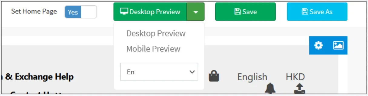
Click [Save As] to copy the current screen.

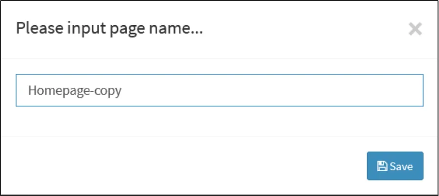
Enter a name for the copied pageclick [Save].
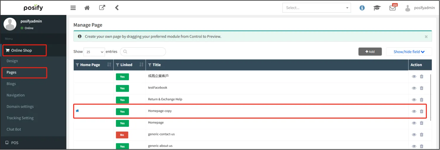
Once copied, you can find the copied page in all tabs.
Component
When designing a page, you need to include different components.
When you move the mouse over a component, five blue icons are displayed on the component.
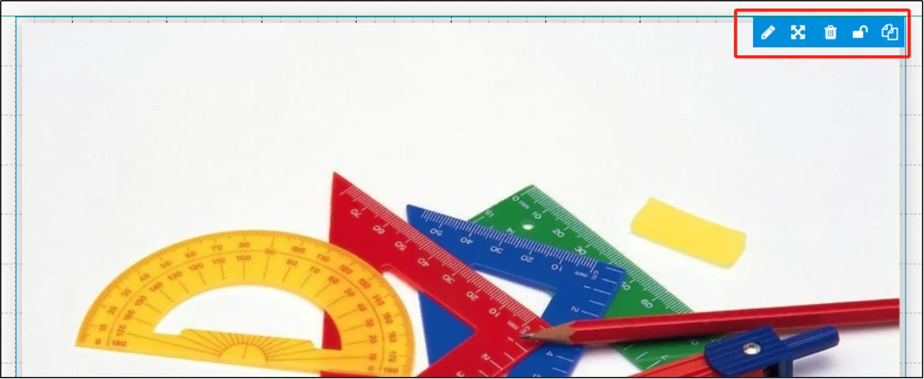
Edit Symbol: Click
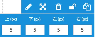
Set margins for a component: Click Enter component margins
Delete Symbol: Click
Lock Component: Click
Copy Symbol: Click
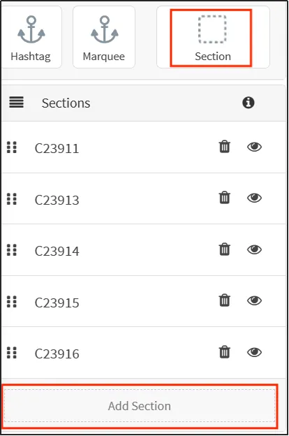
You can add a new section by dragging and dropping the [Section] component or by clicking [Add Section].
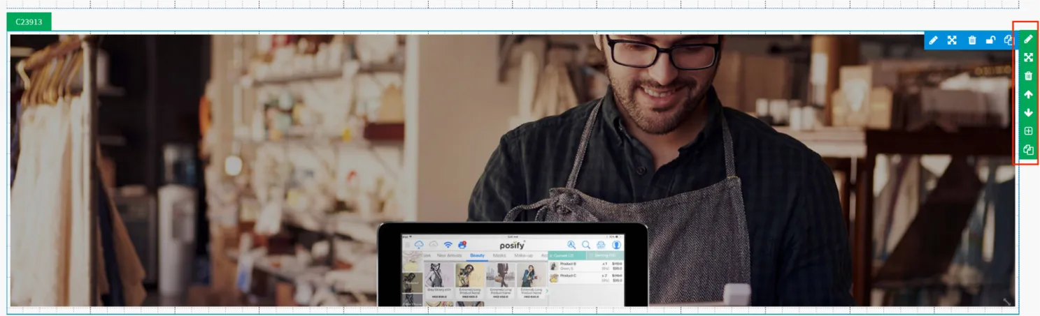
Before adding other components, you should first add a section, and then drag and drop other components into the [section].
When you move the mouse over a section, a green icon will appear on the right side of the section, click the  at the top to edit the section settings.
Select the background color for the segment, or leave this blank or enter transparent.
If necessary, you can upload a background image.
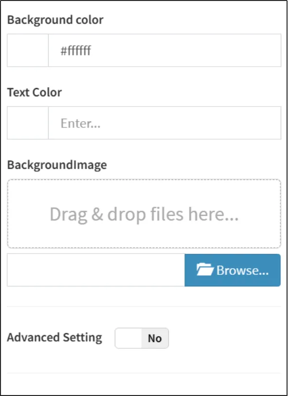
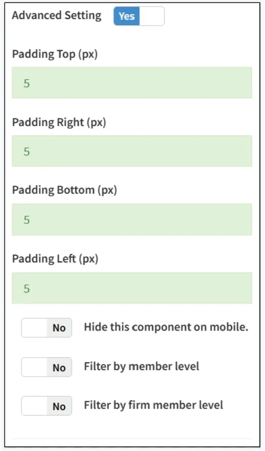
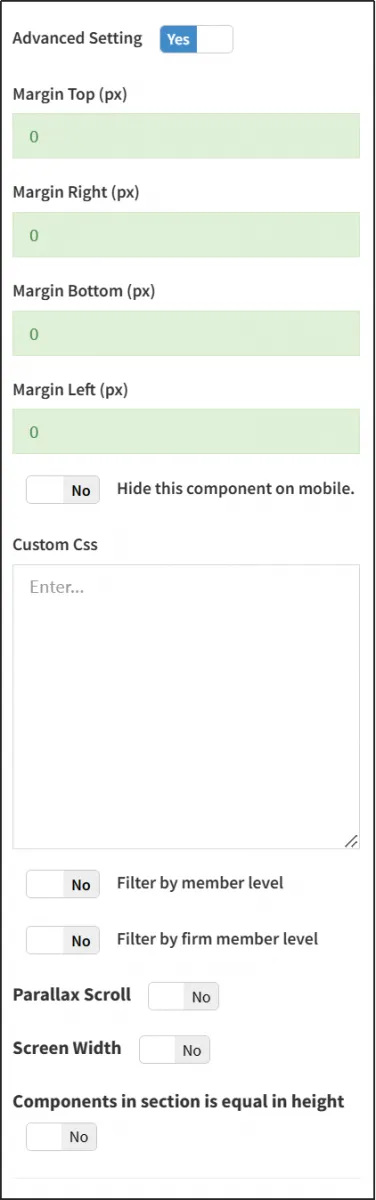
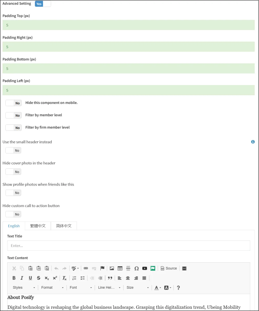
Turn on Advanced Design Settings to edit advanced design settings.
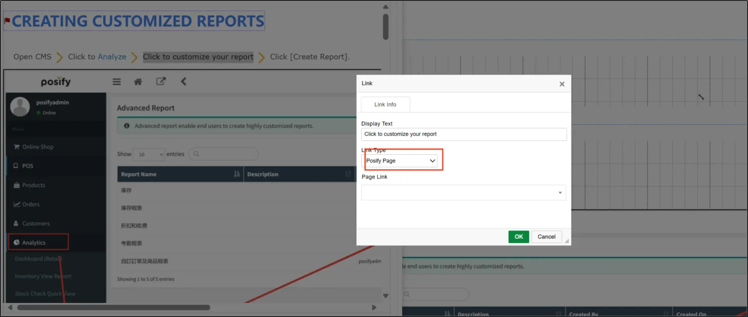
[Rich Text Symbols] allows you to add text, images, and movies, and you can also insert links into rich text content.
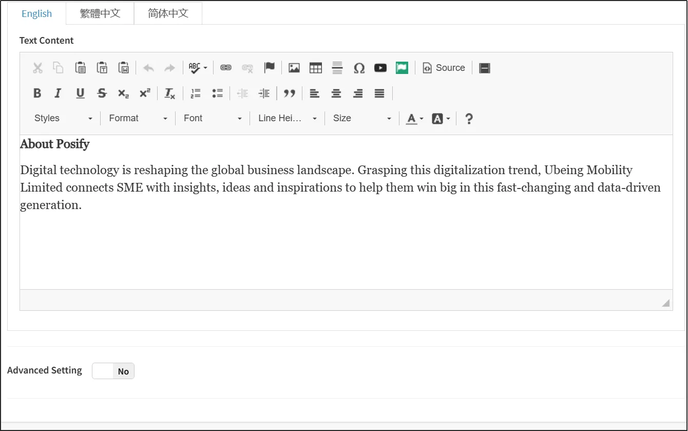
The actual rich text content and style displayed on the site will be consistent with the rich text content and style displayed on the site editor, and what you see is what you get.
Turn on Advanced Design Settings to edit advanced design settings.
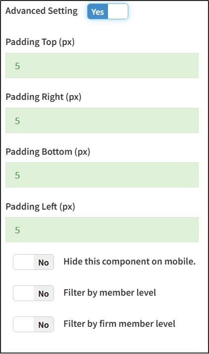
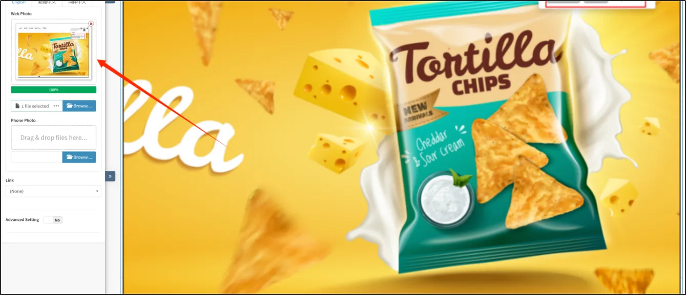
You can add images by using [Image Symbol].
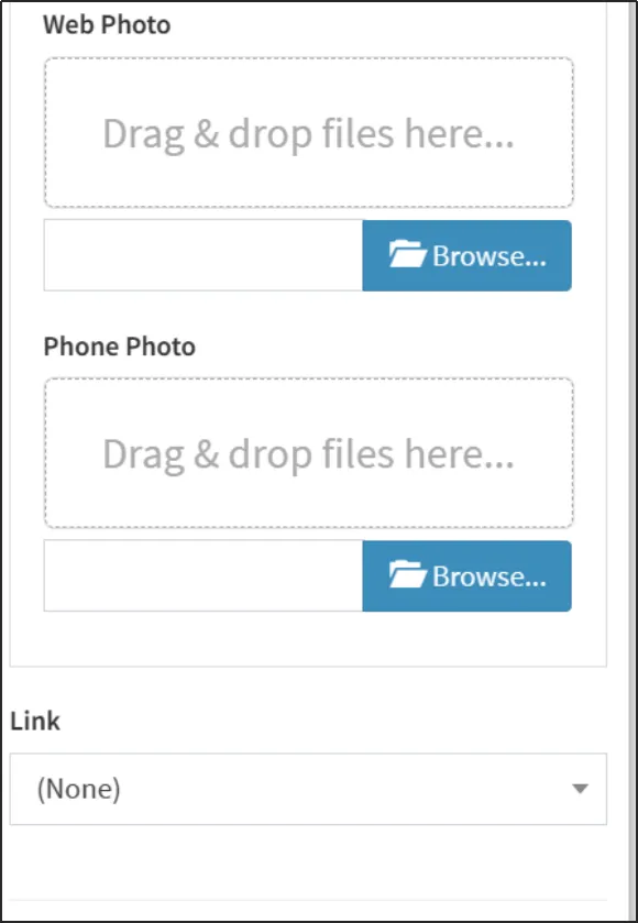
Upload the web version and mobile version of the imageclick [Save]. Whatever image is uploaded by the website editor will be displayed in the online store.
You can also add links to images to link pages you create in Posify, including brands, categories, products, and more.
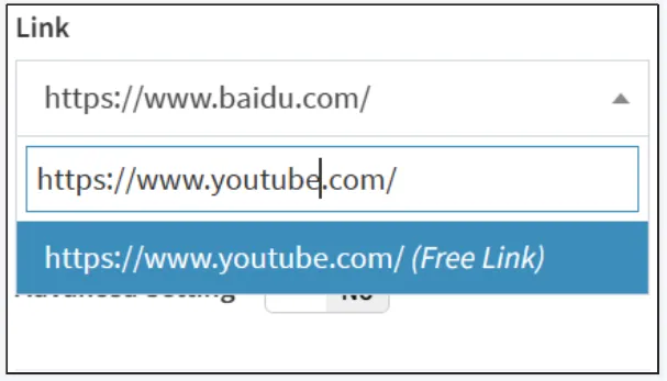
Apart from being able to link to pages created within Posify, you can also customize URLs. For example: it is possible to connect to a YouTube page.
Enter the link directly into the box click the custom link click [Save] in the upper right corner.
Turn on Advanced Design Settings to edit advanced design settings.
You can add slides with [Slide Element].
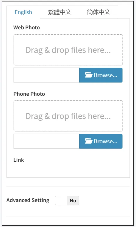
Upload slideshow images, you can upload multiple images at once.
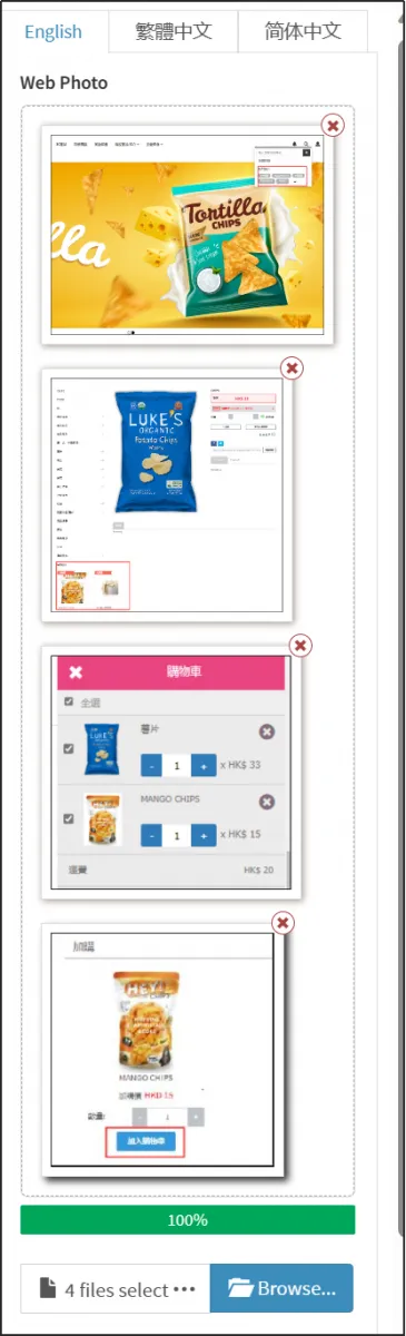
Similarly, you can also add links to images in your slideshow to link to the pages you created in Posify.
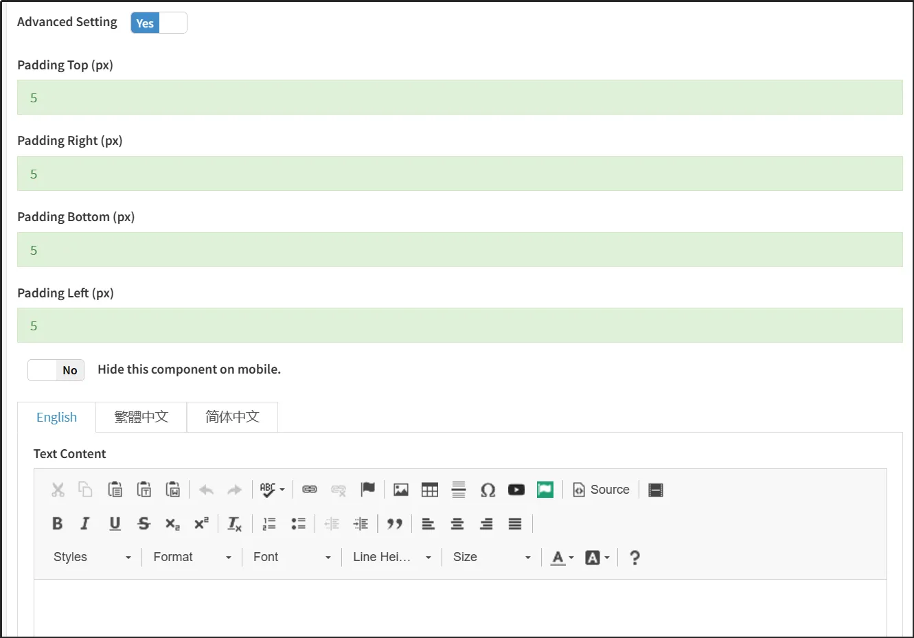
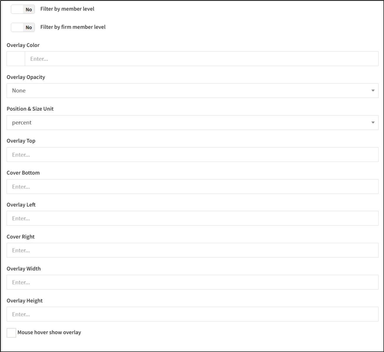
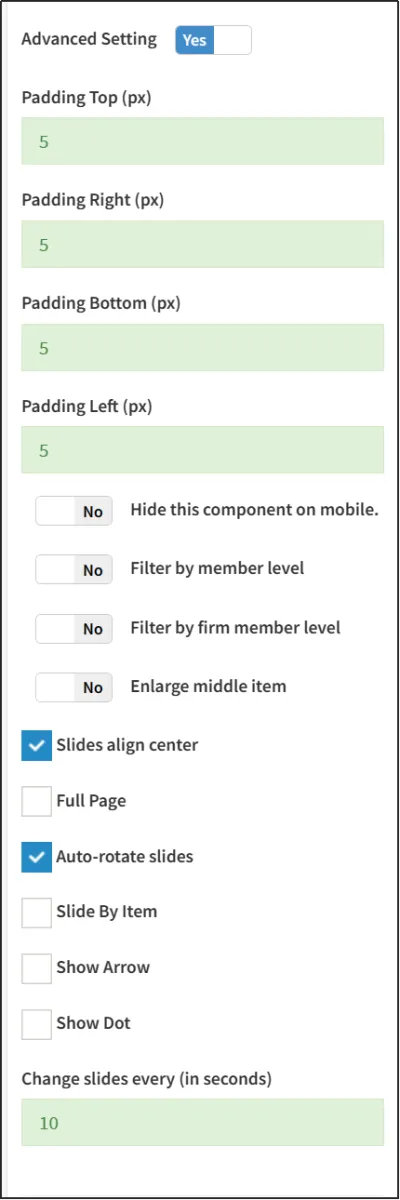
Turn on Advanced Design Settings to edit advanced design settings.
One of the most important is setting [Auto Page Interval (seconds)].
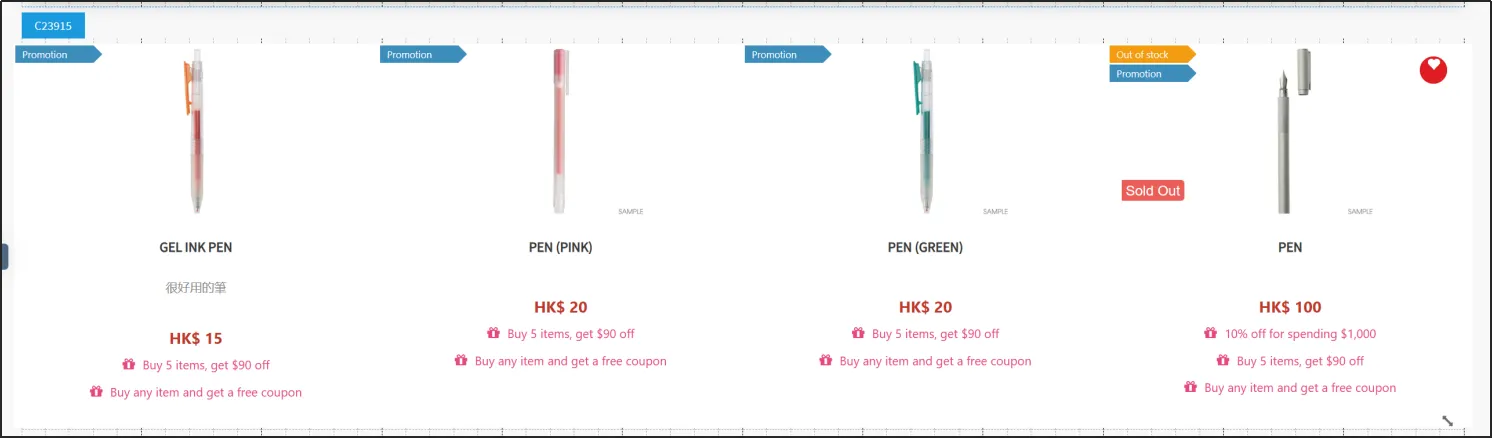
Commodity classification components
Product Category Elements can be used to display product categories.
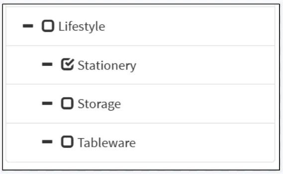
Check the categories of products you want to show.
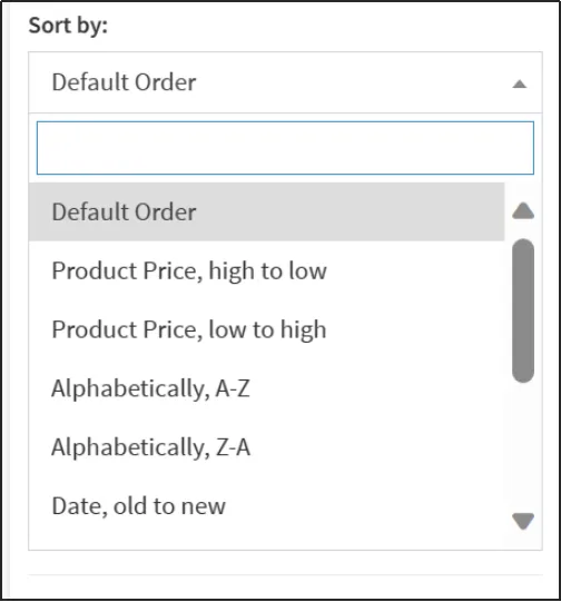
Select a sort method. You can sort by price, alphabetically, or by date.
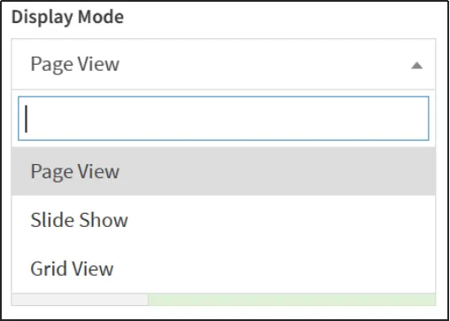
Select a display mode. You can choose labels, slides, or sashes.
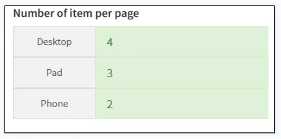
You can set different number of displays per page (product) for different devices.
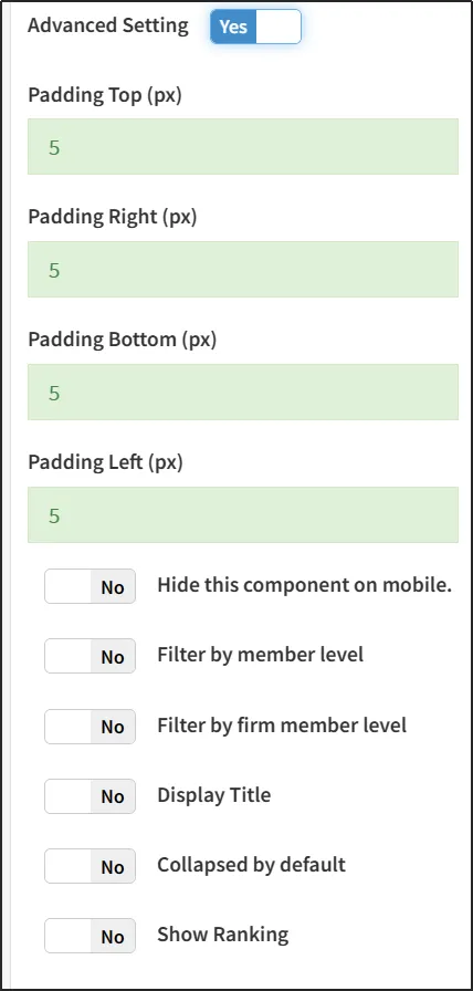
Turn on Advanced Design Settings to edit advanced design settings.
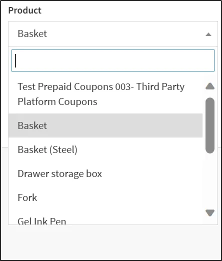
Individual product components allow you to add individual products.
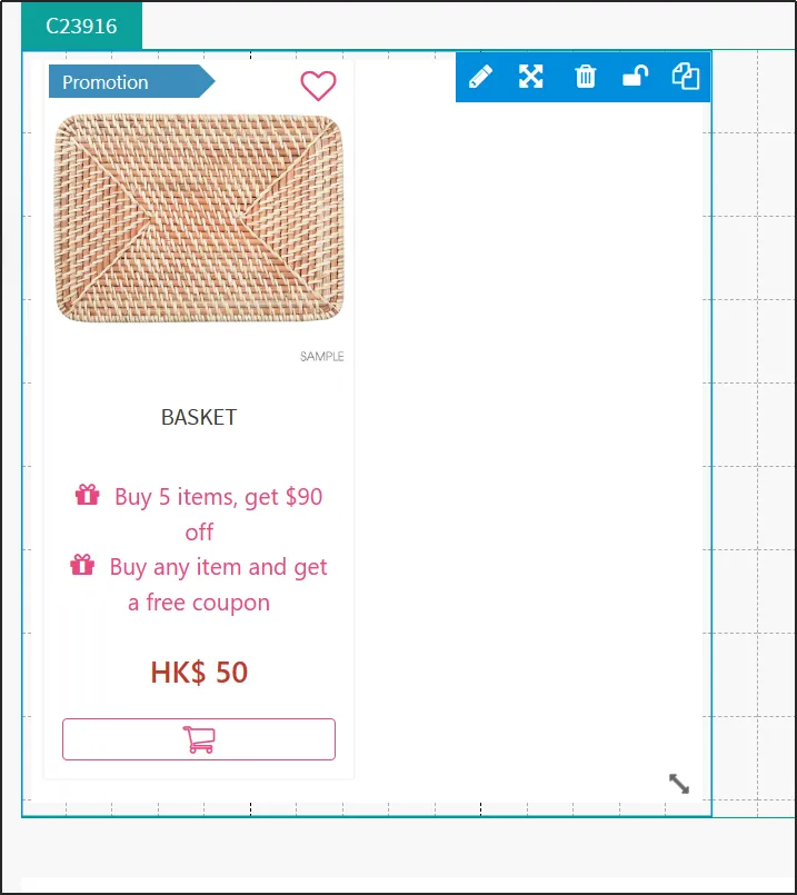
Select a product.
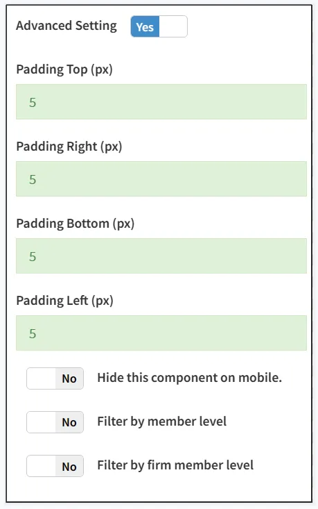
Turn on Advanced Design Settings to edit advanced design settings.
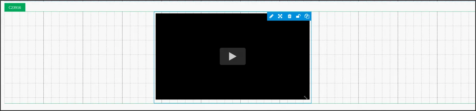
You can add Youtube videos through [Youtube Element].
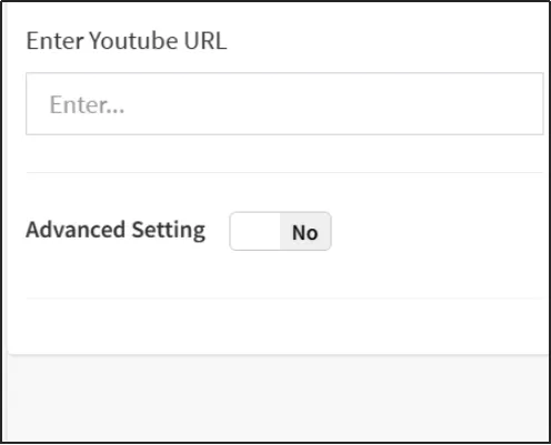
Enter the Youtube link directly.
Turn on Advanced Design Settings to edit advanced design settings.
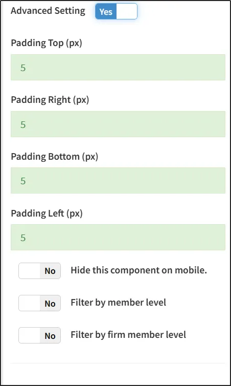
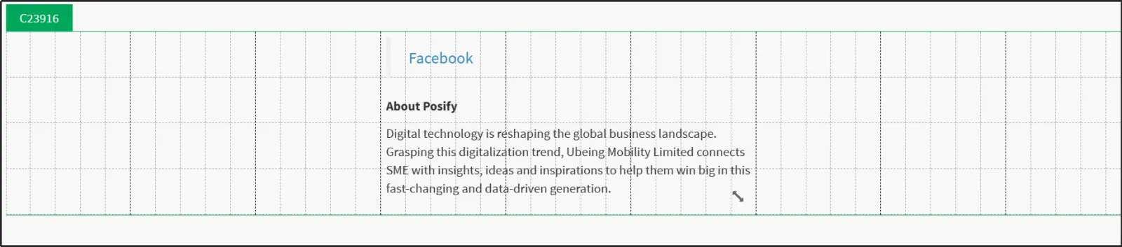
You can join a Facebook page through Facebook Element.
Enter the Facebook page link.
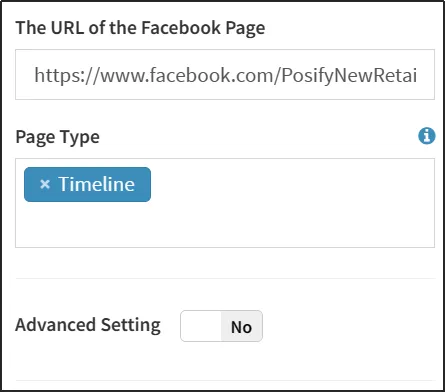
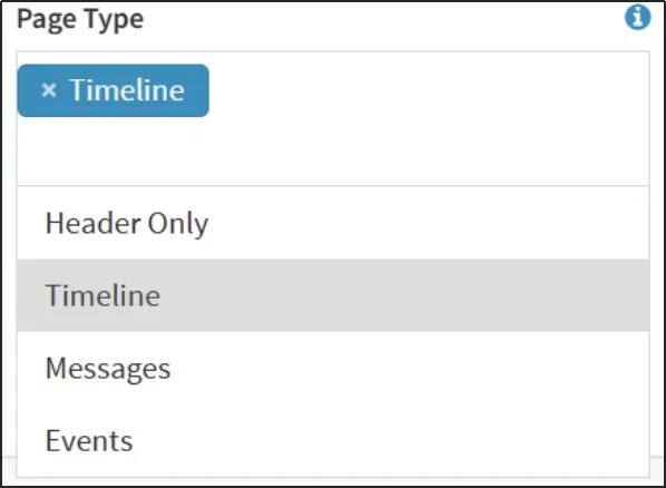
Select a page type. You can choose to show only headlines, life times, messages, or events.
Turn on Advanced Design Settings to edit advanced design settings.
You can add a location using the [Place Element].

The locations shown here are those set by the merchant himself. For more information on how to set up and add locations, please refer to the Playbook - Merchant Profiles & Locations under the General Settings module.
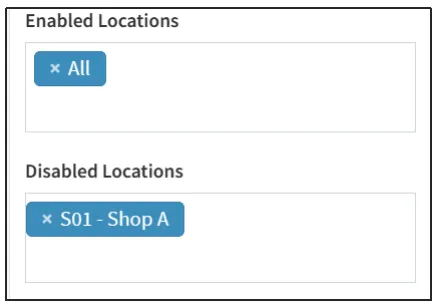
Select the places that are shown and the places that are hidden.
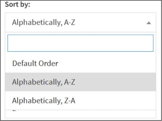
Select the sorting method, you can choose the preset order or alphabetical order.
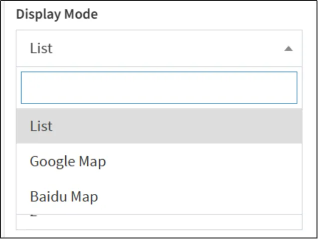
Select a display mode. You can choose lists, Google Maps, or Baidu Maps.
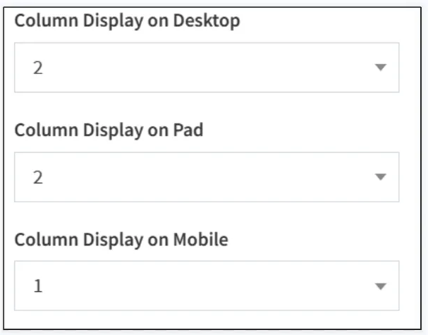
You can set the number of columns to be displayed differently on different devices.
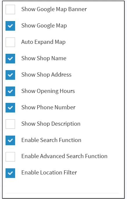
Tick what is displayed.
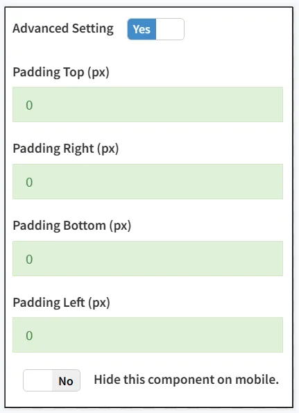
Turn on Advanced Design Settings to edit advanced design settings.
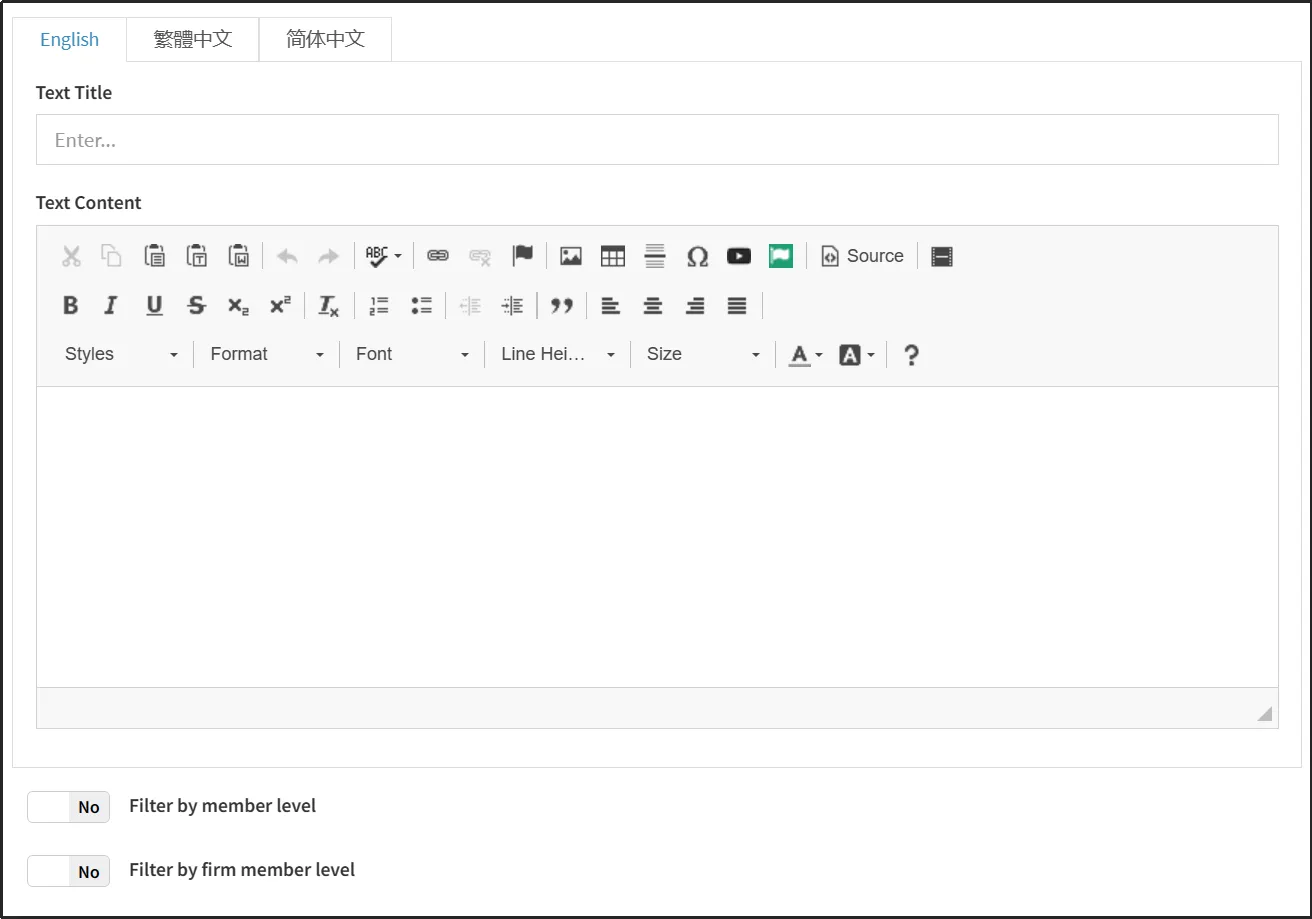
QR codes can be added through the [QR Code Element].
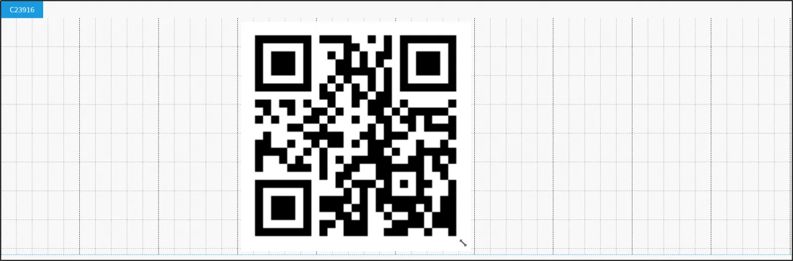
There are five different types of QR Codes to choose from, which are:
Free Text: Enter any text.
Link: Enter a link.
Contact: Enter the contact information.
Phone: Enter a phone number.
SMS: Enter a phone number and text message.
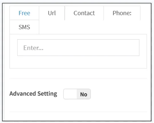
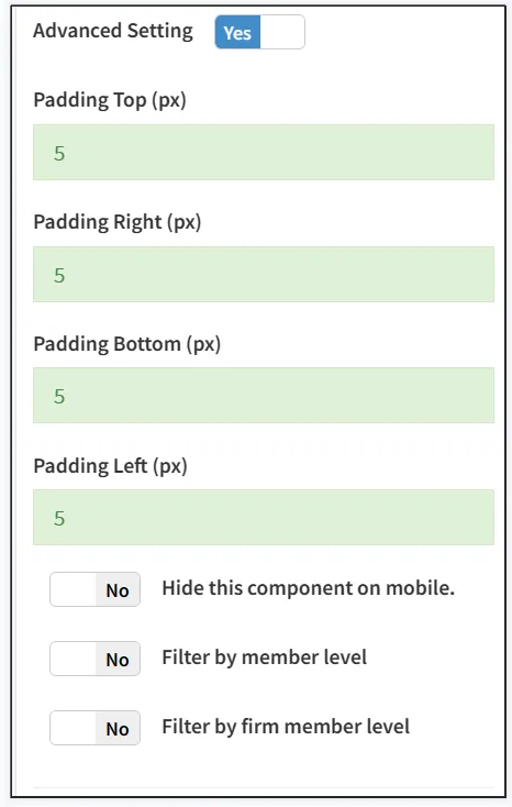
Turn on Advanced Design Settings to edit advanced design settings.
You can add a table using the Table Portlet.
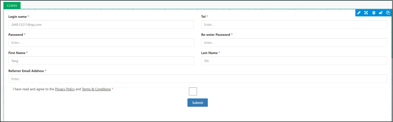
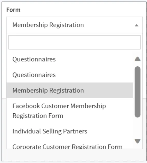
The table selected here needs to be preset in advance. For the default method, see Playbook-Form Management under the Customer module. By default, the table will be displayed in the drop-down box options in the image below.
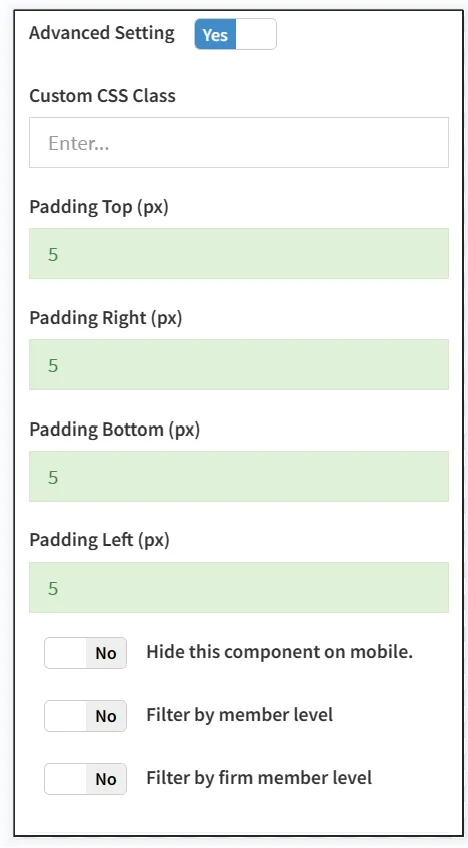
Turn on Advanced Design Settings to edit advanced design settings.
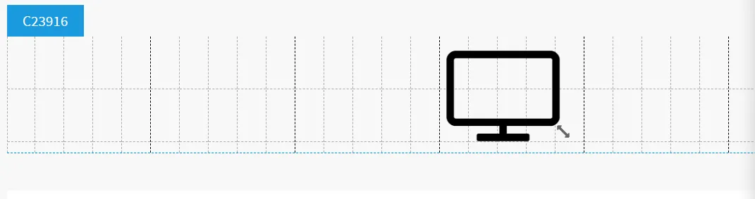
Icons can be added using Icon Symbols.
Choose the right icon, the system provides a variety of icons to choose from.
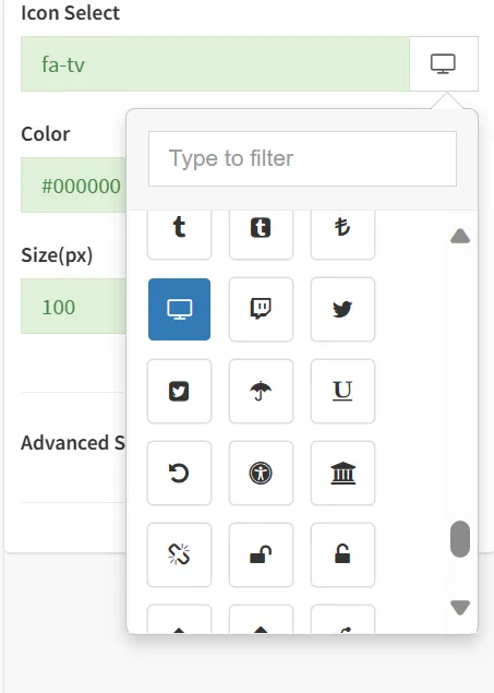
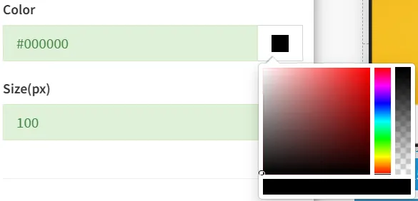
You can select the color of the icon via the color picker, or you can enter the color code directly.
Enter the icon size.
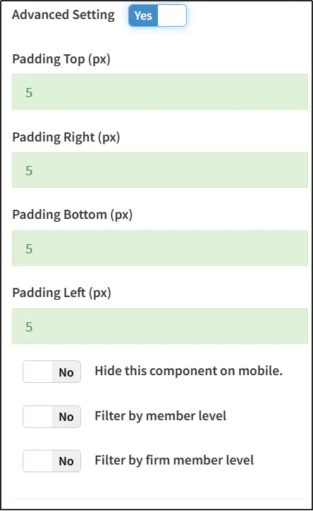
Turn on Advanced Design Settings to edit advanced design settings.
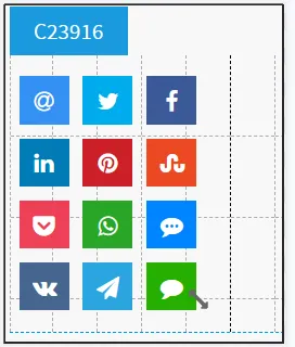
You can add a share button by using Share Symbol.
Enter the text and link to share.
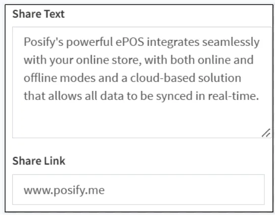
Select the share button shape, you can choose a circle or a square, but selecting a circle disables labeling and quantity.
Note: This function is mainly used in the mobile phone, and the mobile phone needs to install the corresponding APP before it can jump to the corresponding APP.
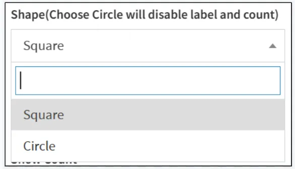
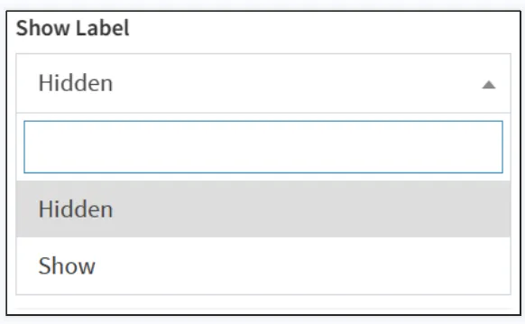
Select whether to display labels and quantities.
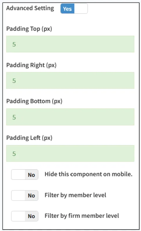
Turn on Advanced Design Settings to edit advanced design settings.
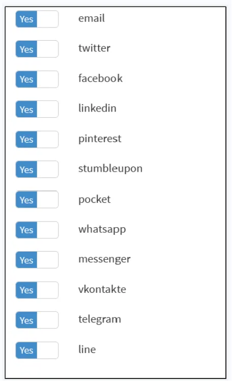
Enable the buttons that need to be displayed.
You can join a blog through the Blog Element.
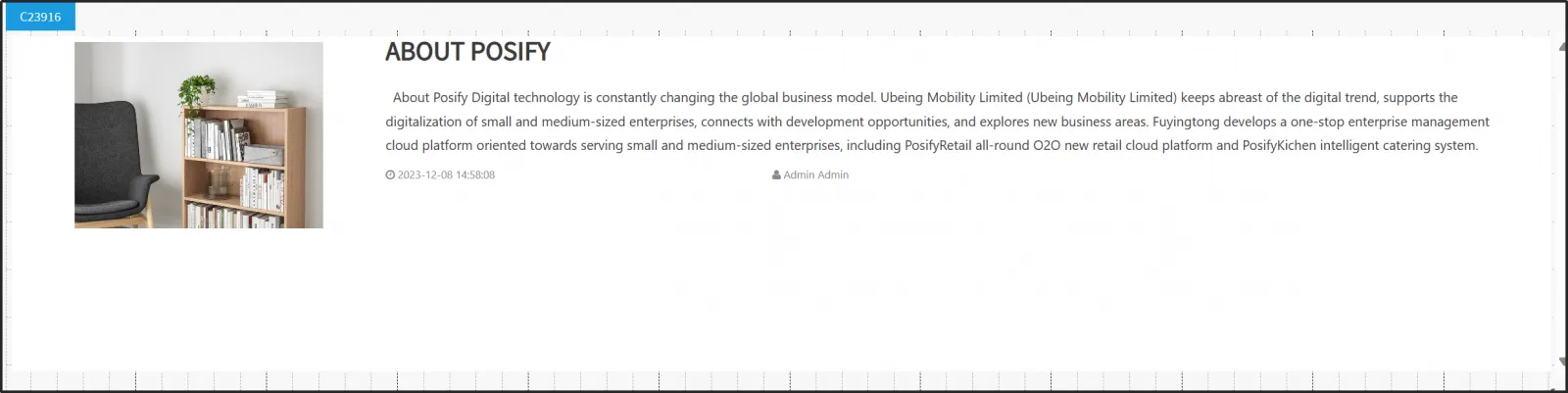
Select the blog you want to display.
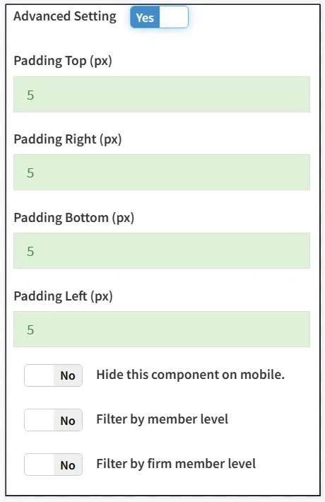
Turn on Advanced Design Settings to edit advanced design settings.
You can use the Blog Column Portlet to join a blog column. Before using this component, you need to create a blog first, if you haven't created a blog yet, please go to the playbook-website blog management under the online store module.
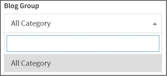
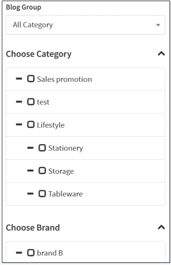
Select a blog group, product category, and brand.
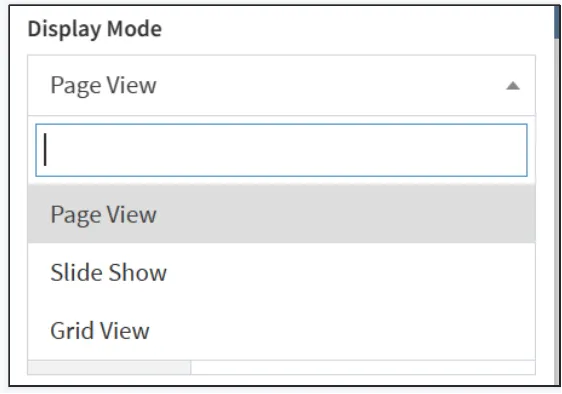
Select the display mode, and you can choose pagination, slides, or boxes.
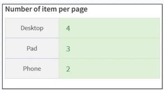
It can be set to have a different number of displays per page (blog) depending on the device.
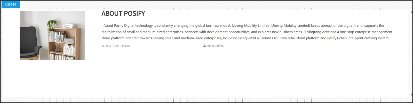
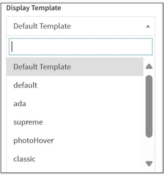
Select a display template.
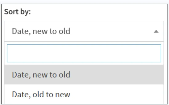
Select a sort method, you can choose to sort by date (newest to oldest) or sort by date (oldest to newest).
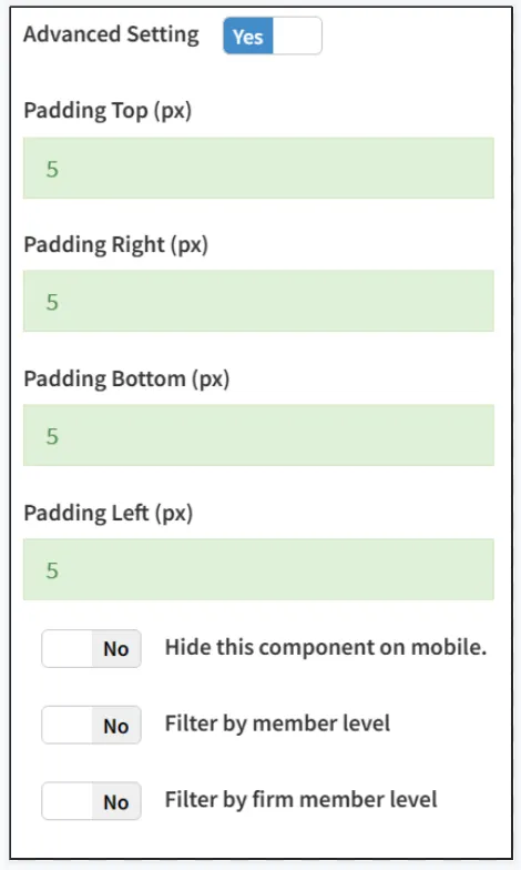
Turn on Advanced Design Settings to edit advanced design settings.
You can use the Brand Portlet to add a brand's product column.
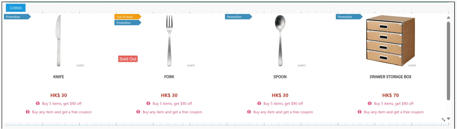
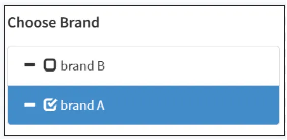
Tick the brands you want to showcase.
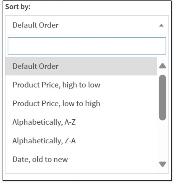
Select Sort By, you can select Default Sort, Sort by Price, Sort by Alphabet, Sort by Date.
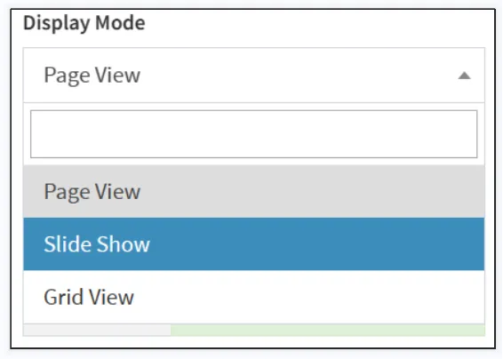
Select the display mode, you can choose pagination, slides, or frames.
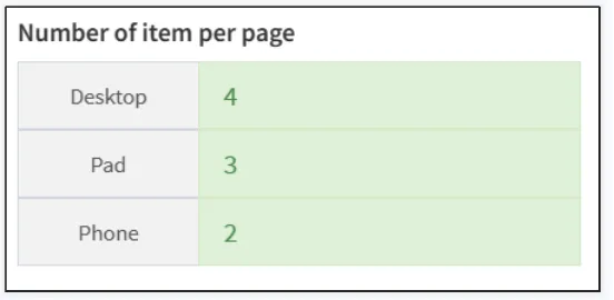
You can set the number of items to be displayed per page differently on different devices.
Turn on Advanced Design Settings to edit advanced design settings.
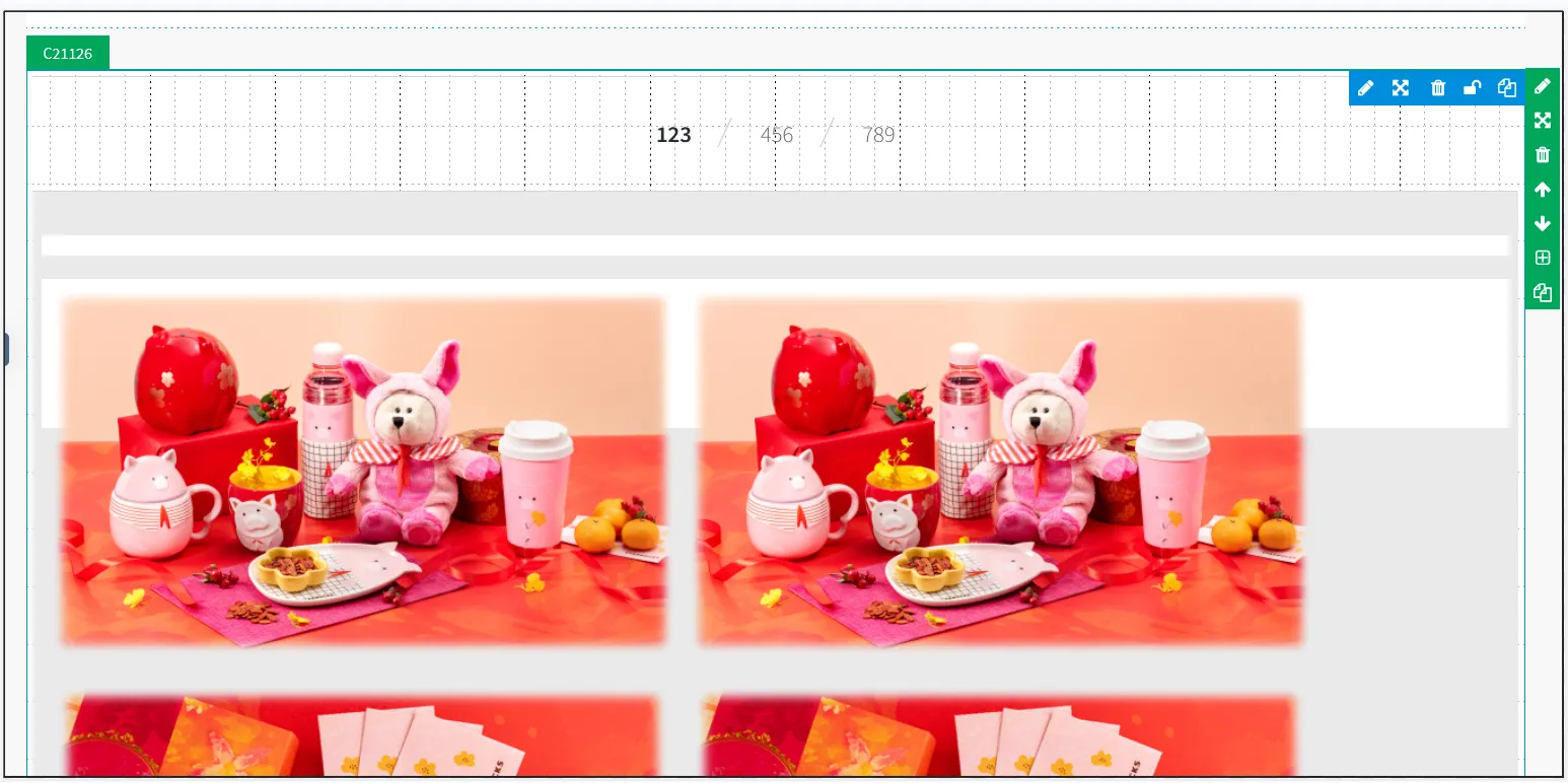
You can use the Tag Portlet to add tags (pages you created in Posify) to a page.
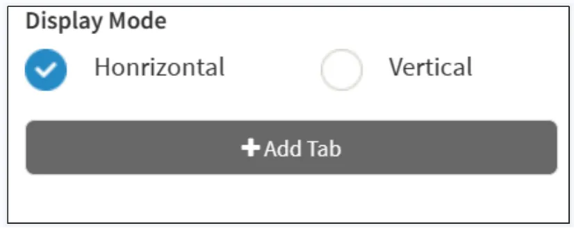
Select the display mode, horizontal or vertical.
Click "Add tag" to add a tag.
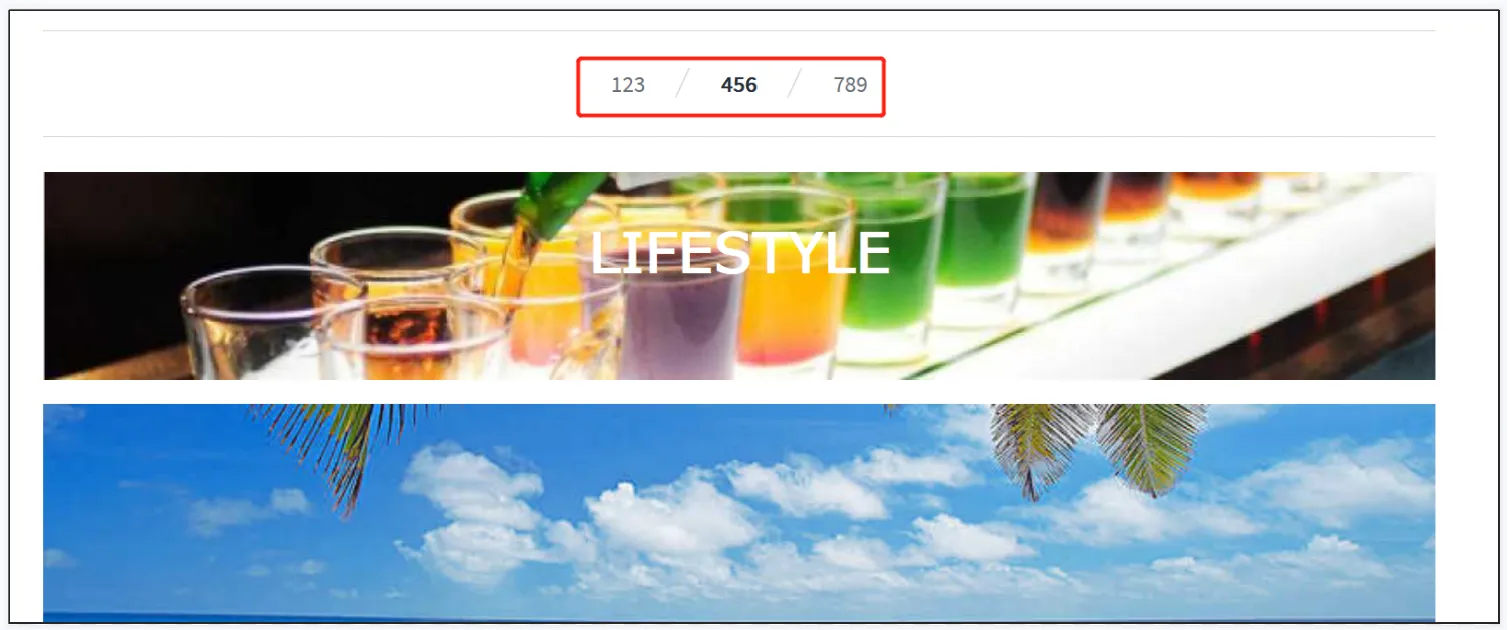
Enter tag title, and select Custom Page to be the content of the page that is displayed under the tag.

In the online store, click on the different tabs to display the corresponding page content of the settings.
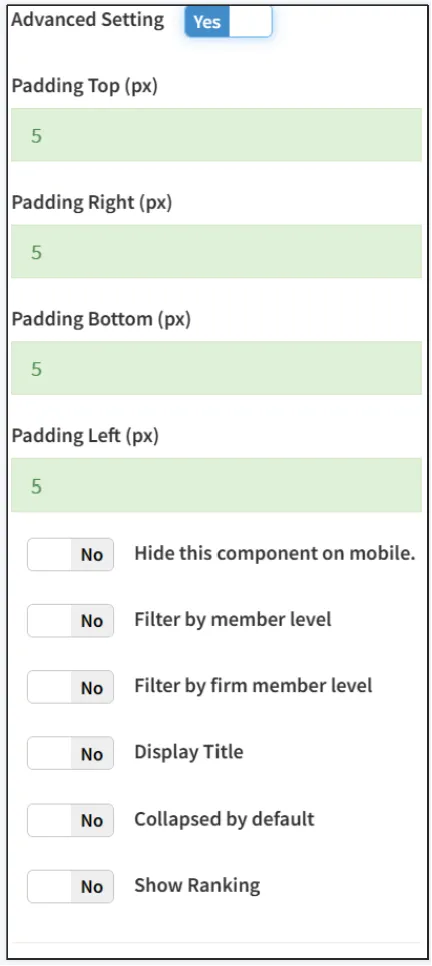
Turn on Advanced Design Settings to edit advanced design settings.
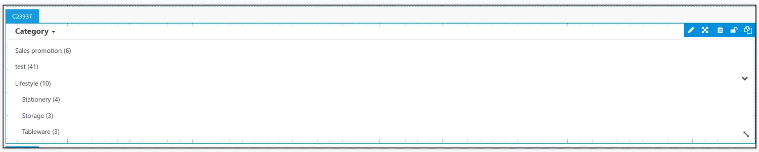
You can select the category to be displayed on your website through the Category Group Portlet.
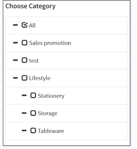
Select the categories that you want to display on the page.
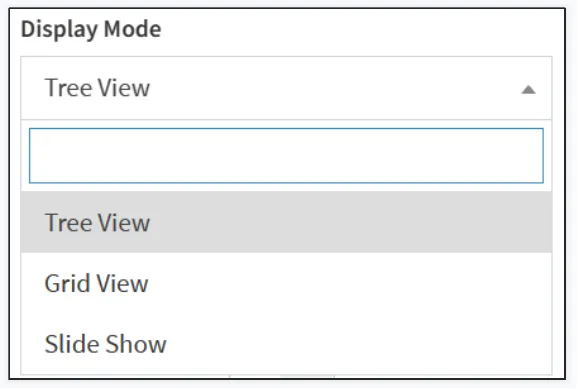
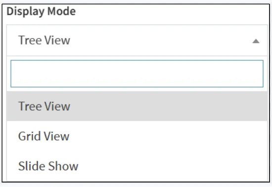
Select the display mode, you can choose between a tree, a box, or a slide.
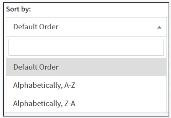
Select the sorting method, you can select the default sort, alphabetical sort (A-Z), or alphabetical sort (Z-A).
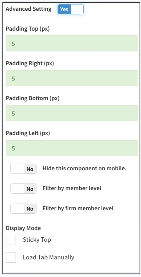
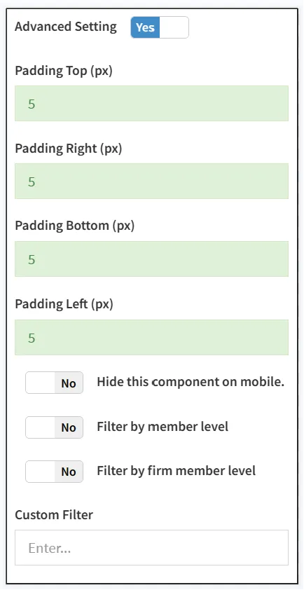
Turn on Advanced Design Settings to edit advanced design settings.
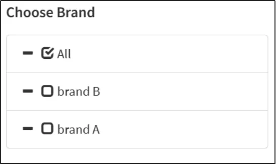
The Brand Group Component allows you to select the brand to be displayed on your website.

Select the categories that you want to display on the page.
Select the display mode, you can choose between a tree, a box, or a slide.
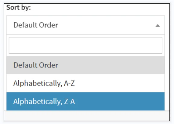
Select the sorting method, you can select the default sort, alphabetical sort (A-Z), or alphabetical sort (Z-A).
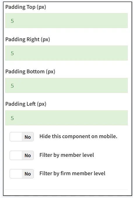
Turn on Advanced Design Settings to edit advanced design settings.
You can add buttons to your website with Button Portlet, and you can customize the text and icon of the button.
Click [Select Default Button from Here] to directly select the default template button of the system.
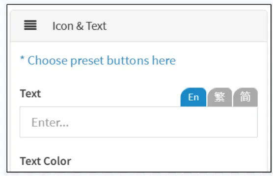
Click the Select Template button click [Use] in the lower right corner.
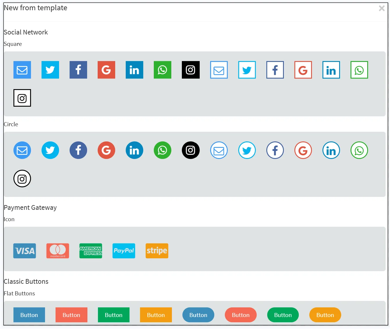
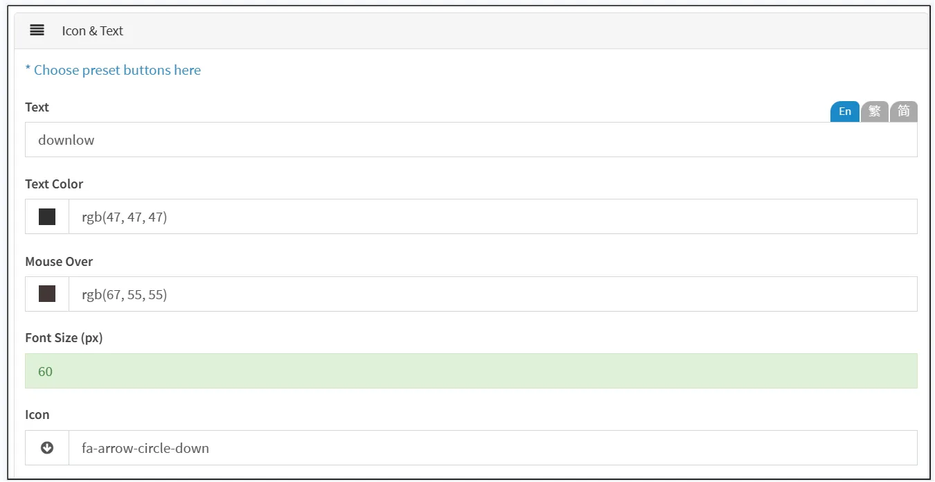
If you don't use a template, you can also customize the text and icons.
Edit the button text, font size, and color under and select the button icon.
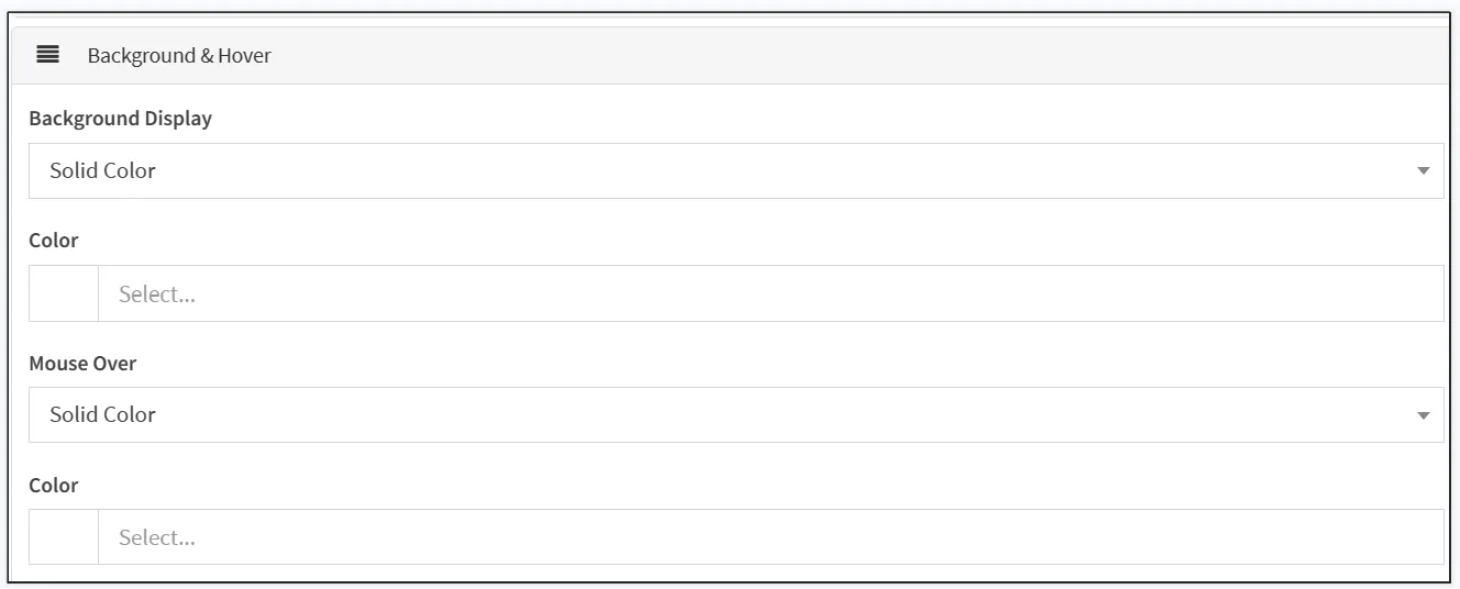
Under Background & Effects, select the display of the background and mouse-over moderation, with Background displaying the color/image displayed when no operation is performed on the button, and Mouse Hovering referring to the color/image displayed when the mouse hovers over the button. You can choose between a monochrome, gradient, or background image.
Monochrome: The background of the button has only a single color.
Gradient color: The background of the button has a gradient effect, and you need to set two colors at the beginning of the gradient and at the end of the gradient.
Background Image: Upload an image as the button background.
Under [Shape & Border], set the width, height, and margins of the button.
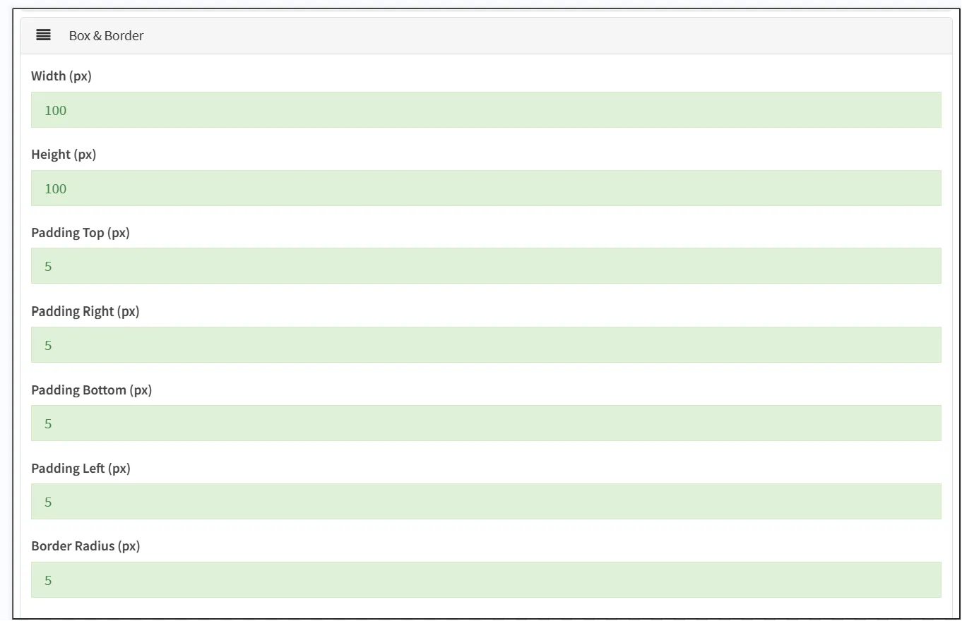
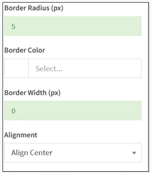
Set the rounded corners of the border, the larger the number entered, the larger the rounded corners of the border, and the more rounded the corners.
Set the color and width of the border.
Set the alignment of the buttons, you can choose to align to the left, right, or center.
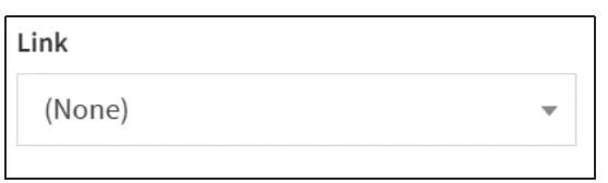
The location of the button link can be Posify's built-in page, including the homepage of the website, the merchant-customized page, and the product page. Alternatively, you can copy an external link to the input box of [Link], and select [Custom Link] to link to an external website.
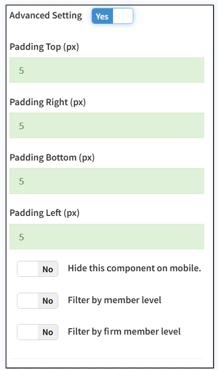
Turn on Advanced Design Settings to edit advanced design settings.
Download the central component
You can add a download center to the page with Download Center Components, and the files displayed in the download center can be downloaded and viewed by customers.
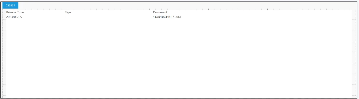
The files that can be downloaded here need to be uploaded in the product-product-related settings-folder settings, and the specific upload method can be found in the playbook-folder settings of the product module.
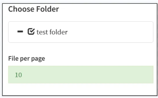
Select the folders you want to display and fill in the number of files to be displayed on each page.
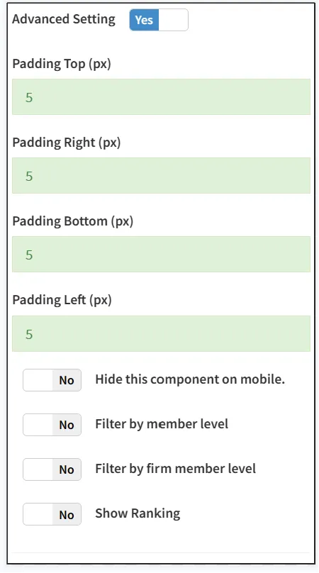
Turn on Advanced Design Settings to edit advanced design settings.
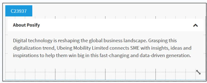
Add a piece of rich text that can be opened/collapsed via [Accordion Component].
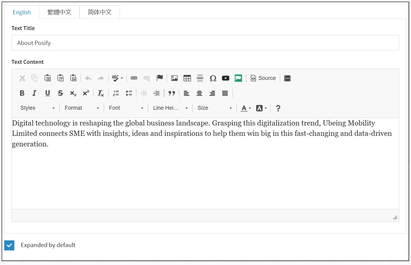
Enter the rich text content, and if [Accordion Symbol] is open by default, check [Content is on by default].
Turn on Advanced Design Settings to edit advanced design settings.